

It also just looked better, aesthetically. As my art school instructors were so fond of beating into our heads, white space is a design element, too. Don’t be afraid of it! White space improves readability by allowing you to focus on the most essential elements of the design.
Too many designers and artists feel like they need to fill up a page or image area, when all that does is create a lot of visual clutter that you feel obligated to read.
It’s not just about the box: the Breyer web site has a similar problem. Even though the site is relatively "flat" - theoretically, you don’t have to click more than a couple times to find the page you are looking for - finding them in those long lists of hyperlinks and images can be a challenge.
More is not always better. I'd be willing to click through an extra page or two if it didn't mean staring at a single page for five minutes trying to figure out which one of the fifty-plus links will take me where I need to go.
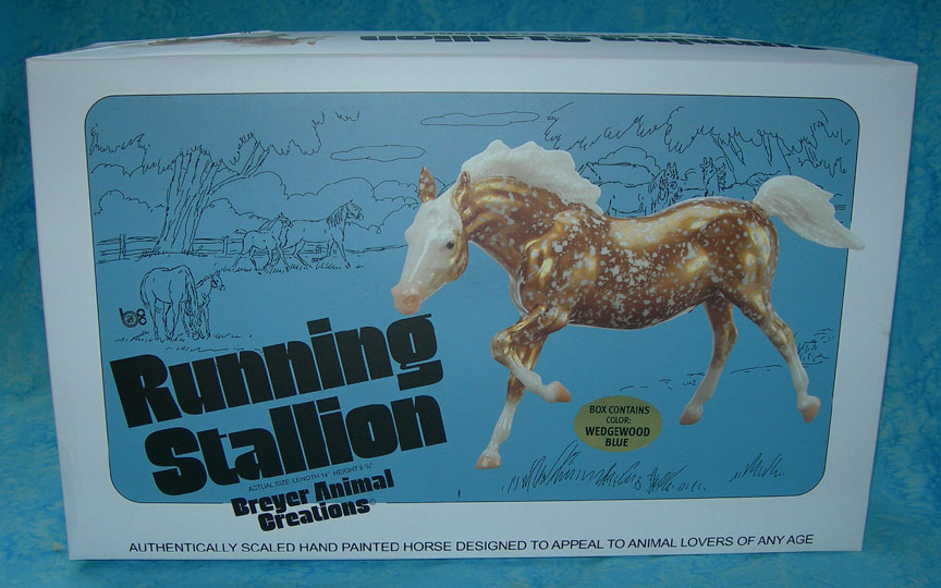
My Running Stallion is quite nice, by the way. No significant issues - other than a slight roughness on a couple seams, similar to some of my original Running Stallions from the 1970s. Unlike those Running Stallions, though, my "Sailor" stands just fine, even on carpeting! Though I've been lucky in that regard: most of my vintage Running Stallions are not tipsy, at all.
(Maybe because, like the Stretched Morgan, I've found so many over the years that I've been able to pick and choose. Another long story, that one.)
I am please that I got the Wedgewood Blue - my favorite vintage Deco color! But I would not have been unhappy with a Gold Charm, either. From the pictures I’ve seen online, Reeves did a stellar job with the Gold Charms this time around.

2 comments:
I'm so glad Breyer is doing this. The Running Stallion is one of my favorite molds--I've loved it ever since I was a kid.
Could you please hammer it into the heads of those who design the Breyer leaflets and catalogs that less can be more? They are so busy that you can't even SEE their product for all the clutter!
Post a Comment