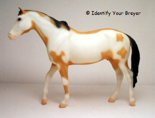
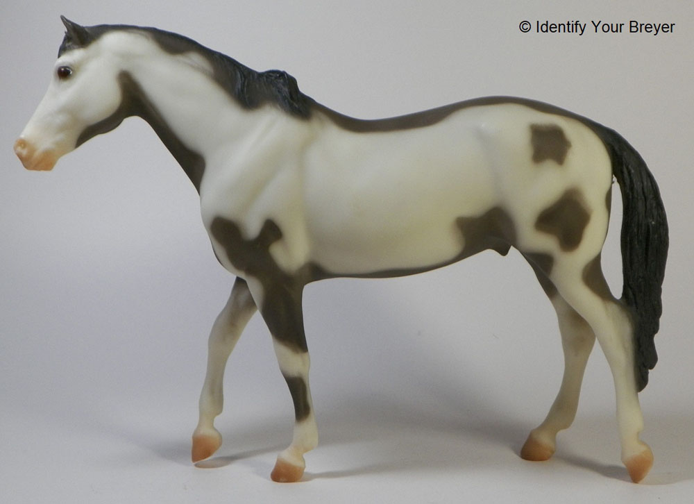
I haven’t joined the Premier Club, but I’ve entered into a partnership with a friend to purchase any releases she doesn’t want or need. It’s a win-win situation for the both of us: she won’t have to go through the bother of finding a buyer, and I’ll occasionally get a random surprise model, which is always fun.
The first of these new purchases was Firefly and Hawkeye!
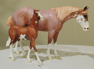
The Foal is just as cute in person as I thought it would be, and the Mare in much nicer than the photos let on. I think it’s the paint job, mostly: it distracts from her lovely silhouette.
It highlights the one problem I do have with Premier Club releases, and a lot of higher end Breyer releases in general: unnecessarily complex colors and patterns.
If you don’t put a “fancy” paint job on a higher-end release, hobbyists complain that they’re not getting their money’s worth on it. But then you have other hobbyists complaining that the fancy colors and patterns are either unrealistic, or not breed accurate.
It’s a darned-if-you-do, darned-if-you-don’t situation.
Taking breed standards out of the equation, some molds look better in solid colors, and others in patterned ones. For example, I think the San Domingo looks better spotted, rather than solid (with the one except being the No-Spot Appaloosa Oxydol, maybe because of his uniqueness?) The opposite is the case with molds like the Traditional Man o’ War, whose admittedly odd proportions can look even odder when enhanced with strategically placed whites.
As much as I want to love him, the 2016 Vintage Club Man o’ War release Storm just doesn’t do much for me. I would have been so much happier with a solid Charcoal, Gloss or Matte Palomino, or even (sigh!) Gloss Dapple Gray or Dapple Black.
(Though if I were offered a Test Color Pinto or Appaloosa Man o’ War, I would take it in a heartbeat, because one does not turn down a Test Color Man o’ War.)
I think that’s why I’m still a little hesitant about Elbe and Spree, the Pinto BreyerFest releases of Firefly and Hawkeye: while I’m sure they’ll be great in person, all I can imagine is how much more I would like them in more common/boring colors – like the original Thoroughbred Mare and Suckling Foal, in plain old (kinda-sorta) Bay and Chestnut.
While I think that would make an ideal future Vintage Club release, I can also see a lot of collectors dismissing them much as they dismissed the recent Barrington – on another Morgen Kilbourn mold, no less. (I thought he turned out fabulous, but I am pretty much a sucker for all of Morgen’s molds.)
(Just a head’s up: I’ll be on more-or-less mandatory overtime through the month of March, so free time will be even harder to come by for me until April-ish. I’m not thrilled that most of my creative life will be on hold until then, but I’m definitely not disliking the paychecks.)